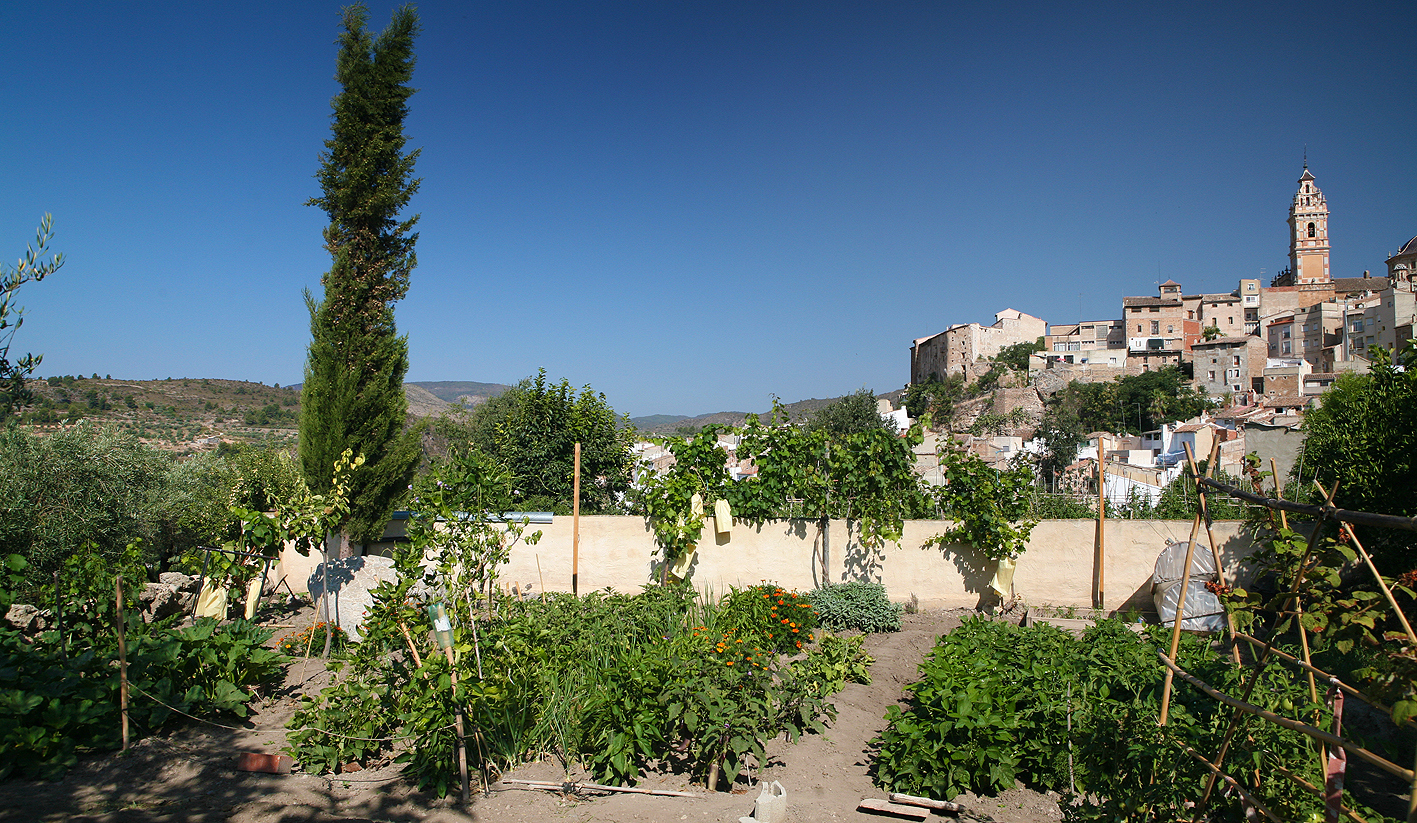
My blog is not only on portrait painting as I said in the beginning. As little I will write about the Opening Celebration of the Olympic Games in London last Friday although I loved to see it… no, about our daily life here: Summer in Chelva. You know we live in the small and beautiful Spanish village of Chelva, Valencia. We are proud to have our own vegetable garden beside the house. This morning we were up early, before the heat of the day. I made the little protection bags to the grapes. My wife did the tomatoes.
View on our garden and village
Can you imagine what it is to work in your garden in the early, fresh hours of this splendid july Sunday morning and having this gorgeous panorama?
If there was an Olympic Medal to win in the section Good Living, I am sure we would challenge for Gold.
I am still working hard on my second video demonstration on portrait painting.
Editing the second video demonstration.
Here I am doing the voice-over. Again in English. I hope it is possible to make the subtitles in Spanish as well. If everything works well I can offer the video in three options: English spoken and English spoken with Spanish subtitles. Also the version in English with English subtitels because I was asked for by a deaf student.
I still need about a month. In august I have to leave Spain for England to do a portrait commission and I don´t think the video will be finished before the trip.
Yesterday someone, who just bought my tutorial video, asked me to explain more about the use of medium and to clarify the issue of warm/cold contrast. Also he asked what colors are transparent and what colors are opaque. I will come back later more elaborate in a special post in my Tips & Tricks section. But already I will give a short comment.
Medium: I usually start without any medium. (sometimes in the background I may start using citrus turpentine to give a thin wash, almost like watercolour) Later, if necessary, I use a neutral drying medium, and in the end when the canvas is already covered with paint I might add stand oil to the neutral medium. But remember FAT over LEAN. Never have a very oily start e.g. with linseed oil. White spirit or turpentine is lean. Thus in this sequence:
White spirit
Neutral drying medium.
Linseed oil, stand oil.
(Later I will comment on quick and slow drying medium)
About the warm/cool contrast: It is not so easy to say what colour is cool and what is warm. For instance you cannot say that every blue is cold or every red is warm. Nevertheless this contrast is important in portrait painting. But to begin with a rule of thumb: Warm light produces cool shadows, cool light makes warm shadows.That means that the cool-warm contrast is also present in one and the same portrait. Usually portraits with indoor daylight lighting has the cool-light >< warm-shadow contrast. In that condition shadows are warm and the basic color for this shadow is often burnt sienna. The high-lights wil have a white+crimson combination. See also this page.
Long time ago I bought a second hand copy of the book Creative Illustration by Andrew Loomis. A spanish version that I could lay my hands on in the Reina Sofia Museum in Madrid. I knew the book from a friend. Long time this book has been my bible, still I look through it once and a while. Excellent explanations on how to draw, how to make a good compositions etc etc. Now this book and some more titles are available in PDF. For free!