Good books

Kees Thijssen, Art Box

Good books.

Kees Thijssen, Art Box
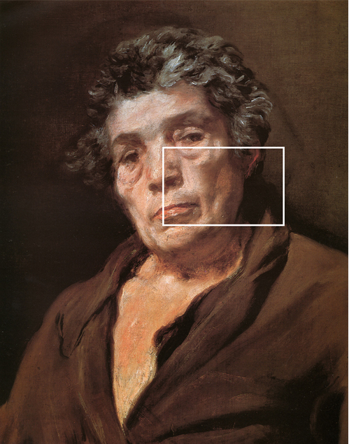
I painted this portrait ten years ago.

Long time ago I worked as a commercial illustrator. My agent was Art Box in Amsterdam. The owner became a good friend. I remember he lent us his car for two month when our daughter was born. “You need a car” was what he said. And indeed a car was most welcome at the time. That was in 1984. Once he gave me a book: “Rockwell on Rockwell”, subtitle “How I make a picture”.

Thinking it over, after all these years, this book made a fundamental change in my approach to how I was working until then. The manner Rockwell explained his “way” to a good painting, how he prepared his work, made me realize the importance of a controlled approach, and later I elaborated this way of working to my portrait painting. I am convinced that separating the main issues in portrait painting can help to overcome problems. Now I call it My Method, well regarded that is nonsense: of course it is not my own invention. I owe thanks to a lot of other art teachers, that I came across in books over the years. And last but not least I learned a lot of the Great Masters of painting like Velazquez, Rembrandt, Sorolla etc. But Rockwell opened my eyes.

Rockwell on Rockwell
The worn out wrap shows the intensive use

Another book that was of fundamental value: Het Tekenen van de mens by Hatton & de Hey. I had to buy this book at the suggestion of Beatus Nijs, my drawing teacher when I was young. Still sometimes I consult this book.

Het tekenen van de mens

The colours on my palette.

The colours on my palette.

This is the list of the colours that I  have on my palette. I am very satisfied with Rembrandt of the dutch brand Talens. Good professional quality. And as I am dutch myself I am proud of this excellent product. The numbers on the list refer to the colour chart of Talens. See here the PDF of the Talens colour chart.

Some notes on the colours.

  • White: I occasionally mix zinc and titanium white. It makes a soft, runny white.
  • Lemon yellow: I don´t need it so often but it makes a marvelous combination with white and carmine. Good for the cheeks.
  • Yellow ochre: One of my basics to make skin tones.
  • Raw siena: Not always on my palette but sometimes useful in receding planes on the forehead. Also mixed with cerulean a nice combination for back-grounds
  • Cadmium red light: Together with yellow ochre a basic for skin tones.
  • Cadmium red deep: A cooler red, nice for blush on the cheeks.
  • Cadmium orange: Mixing with viridian green makes a rich, deep shadow.
  • Venetian red: Sometimes useful for the lips, mixed with white.
  • Indian red: Also sometimes for the lips. And good for making flesh tones for a darker skin complexion.
  • Burnt sienna: Useful for shadows with viridian green. With ultramarine makes it an almost black. With ivory black useful for black-brown hair.
  • Burnt umber: Don´t mix this with the lights. Useful for deep accents, but almost pure from the tube.
  • Carmine: Indispensable but take care: it is very high-keye. Mix with ultramarine and white for a mauve-colour. Useful to cool down fiery skin tones. With white: perfect highlight.
  • Permanent yellow-green: A bright green colour. Useful for sun-tanned skin and sometimes in the face on the temple.
  • Chromium oxide green: A solid green for making a rich brown shadow with cadmium red light.
  • Viridian: Perfect dark colour to start making shadows.
  • Cerulean blue: Appropriate for cooling down fiery flesh tones.
  • Ultramarine: With burnt sienna a good black. With carmine and white makes a mauvish mixture.
  • Ivory black. Nice to make neutral grey´s with white and yellow ochre. With burnt sienna for good deep darks in black hair. Never use black why you need black! I mean for instance in black cloths.

Brushes for oil painting

brushes

What brushes for oil painting?

The large selection makes it difficult to choose. There are basically two divisions:

The shape. a. Flat, b. Round and c. Filbert (cat´s tongue).

The material. a. Natural hair (pig, sable and mongoose.) b. Synthetic hair.

brushes
Three of my favorite brushes.

Painting a portrait I start with the biggest possible pig-hair brush because it has a good loading capacity and it makes a strong mark on the canvas. And filbert because of the possibility to make sharp and a detailed statements without the need to take a small round brush. I end with synthetic filberts to add soft, less-defined marks and for blending. The synthetic round for the highlights and details in the eyes and mouth.  Big flat pig-hair for the background. (Sable brushes are often used for glazing and that is what I rarely do.)

Remember this: “Bad brushes makes bad paintings” Pamper yourself with good brushes!

See also this link

The secret is in the canvas.

Preparing the canvas

“The secret is in the canvas”

Preparing the canvas
Preparing the canvas. Click to see video.

Poor quality of the canvas is one of the most important holdbacks for beginners. In my classes I have noticed that students underestimate this issue or even they themselves are not aware of. Most of all commercial canvas is poor.

The main problem is that it is too absorbent. Paint almost immediately is sucked into the texture and loses its color strength and brush-strokes become dull and inexpressive. Also it is a headache to get the paint on the surface. This inconvenience is an obstacle for many beginners and because of this people even might start to hate the technique. The canvas should encourage you and welcome your brushstrokes!

I use a doubled, linen canvas and even on this surface I apply at least three layers of gesso. I don´t want a white surface so I mix a small dab of neutral gray of acrylic paint: ivory black and yellow ochre. I add this mixture to my gesso and I get a light gray basic tone.

Why paint shadows transparent and lights opaque?

Diego Velázquez, Aesop.

There is some confusion why to paint shadows transparent and lights opaque. A lot of information can be found on the internet but in my opinion, with far too complicated philosophies. It mainly comes down to two reasons and I will try to explain why this tradition for me is essential.

A picturesque reason: Transparent shadows have a rich quality, opaque shadows just don´t work.

A technical reason: It is much easier to get a good connection to a shadow when the applied paint in the shadow is little. (Painting a portrait I start with the darks, then the halftones and then the lights; an important routine)   See also here.

Diego Velázquez, Aesop.