Did you ever notice this, when visiting a museum? Most people look at paintings from faraway. However, a single person is at a distance of a few centimeters to his eyes from a painting. Often this guy is warned by the museum guard: “Please back off.” This chap is definitely a painter himself. I know this because I do the same. I need to examine the painting technique: I want to see brushstrokes, feel the varnish, detect what kind of canvas the artist uses, at the borders sometimes some grounding is visible. I want to discover the secrets. Basically I am anxious to catch a glimpse of the Masters kitchen. People like me always stand in the way. We belong to that special breed among museum frequenters: the annoying visitor. For people like us it’s great that many museums have put some of the highlights from their collection in high resolution on the internet. For example, have a look at this link of the Metropolitan Museum of Art.
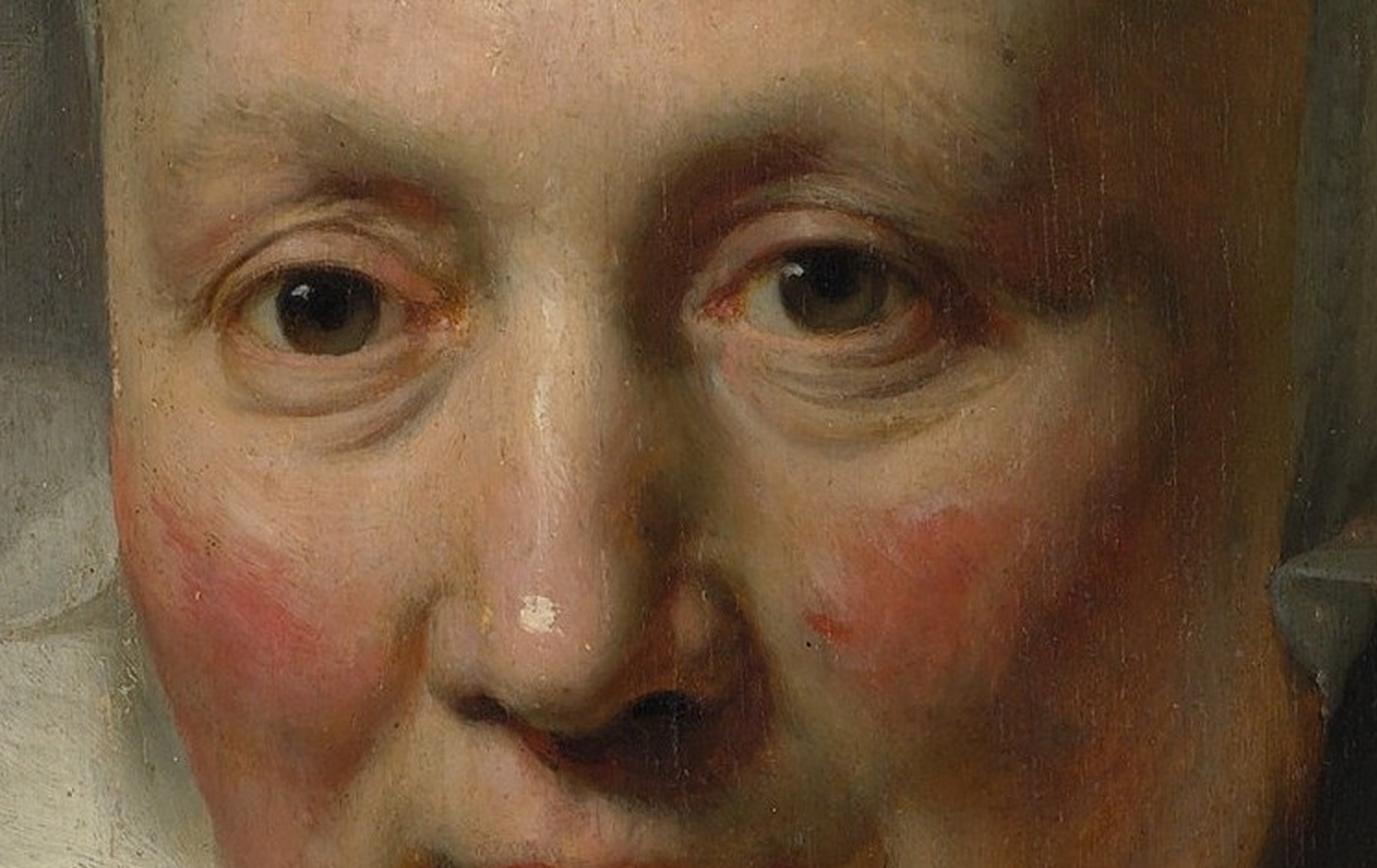
Rembrandt (Rembrandt van Rijn)